 This is my childhood picture. With this assignment we had to find a baby picture and act it out. In this picture I did a lot of clone stamping and played with the contracts.
Monday, May 17, 2010
Childhood
This is my childhood picture. With this assignment we had to find a baby picture and act it out. In this picture I did a lot of clone stamping and played with the contracts.
Diptic
 This is my Diptic. i was focusing on showing some kind of stone in both picture. I didn't really do much to either of the photo.
Drip
 This is my drip photo. With this photo we were just taking pictures of water that was falling from a bag. All I really did with the photo was played around with the contrast that is how it go the green tint.
Friday, May 7, 2010

Friday, April 30, 2010
Shells
 This picture is for the assignment for object of still life. I took this picture with a warm light and a cool light. I didn't really change anything about this picture. I really like how this photo turned out and love the shadows that are shown in this picture.
Wednesday, April 21, 2010
Flowers
 This is a picture of a tulip that I turned in to a black and white photo. After that I took a colored copy of the same photo and played around with the saturation to make it have a a lighter color to it. I placed the lighter photo on top of the black and white and played around with the opacity. I really love how this photo turned out.
 This is a picture of two flowers that my mom had in the house. I placed them in the water of the lake that I live on. I played around with the angles that I took of this photo. I also put a photo filter on top of it to help bring out the colors. I boosted the colors even more in iphoto. I also blurred the edges so that your eye goes to the flowers. I really like the composition of this piece.
Tuesday, April 20, 2010
Greek Myths
 This photo is representing the Greek Goddess Zeus. Zeus is the goddess of the earth and the sky. I took this picture focusing on the sky. I made the foreground darker to make the sky pop. I also played around with the blue in the sky and burned the top of the sky.
 This picture is representing the goddess of Alcyone. Alcyone is the goddess of sea, moon, and clam. I took this picture focusing on the clam of this goddess. She is walking because when she walks it makes her clam. I boosted the color of my photo so that the colors were more bold. I really like how this photo turned out.
 Wednesday, April 14, 2010
Texture
 This is a picture that is showing texture. I really didn't do much to this picture. I played around with the brightness and the contracts. I really like how this photo turned out I like the composition.
Tuesday, April 13, 2010

Environmental
 This is my environmental portrait of my friend Hannah. I put her outside because she loves being outside with others and loves her dog. I crop the picture a little and burned the garage because it was to bright. I really love how this picture turned out.
Thursday, March 25, 2010
IB Studio Portraits

 For these photo we were to take a picture of two IB students. I had no really idea foe these pictures. I just let them be them self. I just want to capture there true personality in these pictures. I charged these pictures in to black and white and I played around with the brightness and contracts to. I really like how these pictures turned out.
In Class Portraits

During class we have to pick groups and then pick a person that you wanted to take a picture of. I choose Kayla because I love the way that she smiles. So that is what I tried to show in this picture. I want to show her bubbly personality. I changed this photo into black and white and then played around with the brightness and contracts. I really loved how this photo turned out in the end.
Friday, March 12, 2010
Portrait
 This photo is a photo of my friend. The lighting in this photo is rembrandt. I used a filter to make the photo warmer and I blurred the background so that you would focus on her more. I really like how this turned out.
 This is a picture of my friend again. I took this photo when it was gray out side. It was really hard to take photo because I had no sun light to help make my photo pop. I add a background to my picture. It is just a piece of the photo but very big. I also boosted the color of this photo. i really like how this pictured out.
Wednesday, March 3, 2010


This week we were working on lighting. My photo are split lighting and butterfly. My first photo is of butterfly lighting. I blurred the background so that she would pop out more then the background. This picture is ok I wish it would of been lighter. My second photo I used split lighting. I also changed it to black and white because I like the different effects that it gives to the photo. I really like how this turned out. My third photo I used spilt lighting. I didn't do anything but crop it a little. I really like how this turned out and am very proud of my work.
Monday, March 1, 2010

Orange


 These photo were taken by Emily Karis. I choose the color orange because it is a different color. Orange is a power color. It is one of the healing colors. It is said to increase the craving for food. It also stimulates enthusiasm and creativity. Orange means vitality with endurance. I took the pictures of the orange flowers because I thought that they were different kind of flowers and they had different textures to them. I took the picture of the crocs because I love crocs but I also thought that they had a good texture to the shoes. I took the picture of oranges and the Orange yarn because I thought that they were just good things to represent the color. Overall I really like my photo and how they all turned.
Friday, February 19, 2010
Portrait of Katie
 This photo was taken by Emily Karis. i am using this photo to represent a portrait. I used an ISO of 800 for this photo. I also blurred the corners so that she would be the main focus of the photo. I like this photo but it is not my favorite and think that I could of done a better job.
Select focus
 This photo was taken by Emily Karis. I used a macro setting in this photo. I really like how the flower is the focal point of this picture. I also like how the different colors that are in the photo come together and make a great photo.
Things that bother me
 This photo was taken by Emily Karis. This is a picture of a bumper of a car. I took it because I don't like winter and I don't like how dirty my car gets. I add a texture to the snow because the snow was to bright and need something to clam it down.
Landscape
 This photo is taken by Emily Karis. This photo is a picture of landscape. I used a ISO of 400 and a sunny setting that I have on my camera. I could not make this bright and that is one of the things that I don't like about this photo.
Portrait of Lauren
 This photo was by Emily Karis. I blurred the background so that she would pop out more then the background. I also enhanced the color so that the photo would be warmer. I really like this photo because it is not a very busy but has so much meaning.
Landscape
 This photo was taken by Emily Karis. This photo is showing landscape. When I took this photo I was trying to a photo with different colors. I really like the colors that are enhanced in this photo.
The things that bother me
 This photo was taken by Emily Karis. This photo is a picture of something that bothers me. I hate when people leave things uncovered and that is why i have a cookie cake that is uncovered.
Select focus of Roses
 This photo was taken by Emily Karis. This picture was taken in the macro setting of my camera. I used an 800 ISO and over exposed it a little bit. I really like how this turned out because of the colors and the way that the flowers look.
Texture
 This photo was taken by Emily Karis. This photo is showing different textures and different lines thought out the whole picture. I really like how the shadows of the tree come into this picture. It makes the picture have a different mood.
Texture
 This photo was taken by Emily Karis. When I took this picture I was trying to grab texture and lines in this photo. I also made the photo have a warmer tone to it because it was lighter photo and adding the extra tone made it a better photo. I really like all the different textures that you get and the line that you see on the wall.
Portrait of Ashely
 This photo was taken by Emily Karis. This photo is a picture of my friend at a swim meet. This is to demonstrate a portrait of someone. I blurred the background so that she would stand out. The bright colors also help make her pop for the rest of the photo.
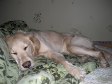
Portrait of my dog Abby
 This photo was taken by Emily Karis. My idea for this photo was a portrait and it was to fill the frame with my dog. I blurred the background a little so that the dog Abby would be the focus. I really like how this turned out. I like how there is a tone in the photo that makes it warm.
Friday, February 12, 2010

Wednesday, February 10, 2010
 This photo was taken by Emily Karis. This picture is layers of the same picture but different angles and different contracts. The reason why I choose this picture was because I want to make sure that I had a simple photo as my base because I tried with a background that had more to the photo and it didn't work well. This picture has about 60 different layers on top of one another. I am happy with how this turned out. One thing I really like is the different contrast in the photo.
Friday, February 5, 2010
This photo was taken a macro setting that was on my camera. I used a 800 ISO and I overexposed it as well. I used the higher ISO to help catch the detail of the photo and i overexposed it because I need the light to help make the photo clear. I like the idea of the photo that I took but I wish that it might of been a little lighter. I want it lighter because all you really see is the letter but really there is so mush more in this photo.

 This picture was taken in the macro setting. i also over exposed this image at the same time. over exposing it made the photo have a much warmer feeling and I really like that in this picture. I also used a 800 ISO and I feel that that helped me catch the detail that I have in the front of this picture. I also used a candle mode because the flame was not looking good when I didn't use that mode. I really like how this photo turned out. I really like how simple the picture is but it shows something much greater.
 This photo was taken with the macro setting. I didn't under or over expose this photo. But I add a warm tone to the photo when I was working on the picture. I feel that this warm tone help make the color pencil a little more notice able. For this photo I used a ISO of 400. The higher ISO I think help the picture show more movement.
 This photo was taken in a macro setting on my camera. It is also overexposed about .75 and I had the ISO at about 400. The reason why i overexposed this photo is because it made the photo have more light in it. I also blurred the corners so that the clarinet would stand out more then everything else. I really like how this pictured turned out. I feel that it has a nice compensation and it is very detailed.
Thursday, February 4, 2010
 This is my montage that I created. I was to ask my friends for 8 things that describe me. The first thing that they said was that I am a very happy and bright person and that is why I put a smiley face. I put a horn because sometimes I can be a very loud person and people will know that I am in the room. The next thing I put was the candles that are different color. I took this from a different picture but I am way different from anyone that my friends knows. That is why I put different candles to represent how different I am. I have a pink flower because I really like that color and I love flowers. I put hands on my montage because I am a person that loves to help. The hands are representing my helping hands. I put music notes because I am in band and I love sing in front of my friends. I put the heart on because I am a very love able person and I have a open heart. I will do my best to love anyone and I don't judge people with out meeting or talking to them first. I have swim goggles because that is my life. I have been swimming on a team since I was 5. I put a cookie on because I love baking and everyone loves what I make. My final two things are what are on my background. I have a tree which represents the hard worker that I am and it also shows the strenght that I have to this day. Your strenth grow just like you do and that is why I used a tree. For the clouds, I used them because they represent how my life was not that easy but as the clouds go away and the sky gets clear my life is changing and becoming what I want it to be.
Wednesday, February 3, 2010
 This photo was taken at nature hill. I took this photo with a 80 ISO because I look didn't want to change anything of this photo. I was walking and saw this great photo and new that if I would of used to high of a ISO I would of got a way different photo. In this photo is shows a great deal line. The trees are going in different directions and so it so an example of curvy, horizontal, and vertical lines. I really like how this photo turned out in the end. I like how it is a simple photo but shows so much meaning.
 When I took this photo I used a 200 ISO. I didn't want to use a higher ISO because I didn't want to loss the detail of everything that surrounds the water. The focal point to this photo is the tin tub. i wanted that to be the focal point because it was a different color then everything else but also it makes the viewer look at the detail of everything around it to. I was very happy with how this photo turned out because i really like the compensation of this photo.
 This photo was taken with a higher ISO. I took this photo with a 800 ISO. I look back at this photo and i am not sure if that was the right thing. I feel that I lost some of the detail that i could of had in this photo with using a higher ISO. But I really like how the sun is peeking around in the back of the photo. I feel that it adds a warm tone to the photo but it was really not warm at all. I am not very happy with how this photo turned out in the end.
 This photo was taken with a low ISO. I took this photo with a 100 ISO because I didn't want to loss any of the details in this photo. I feel that this photo has a great compensation because your eye goes to the stool. The stool is what I want to be as my focal point. Also with having a lower ISO I kept more of the detail of the snow in this photo. Overall i am happy with how this photo turned out.
Tuesday, February 2, 2010
 This photo was taken with a -.5 compensation. There was so much light that I need to make the photo darker. So I went to go into the negative side of the spectrum. I feel that this photo has good colors that travel through the picture. The viewer would see movement through the picture because of darker colors that I have in the frount the lighter background. Your eye keeps moving to the back.
Subscribe to:
Posts (Atom)